
Drag in any direction or use the arrow keys to explore the infinite grid. Press Enter to open the image in the middle.
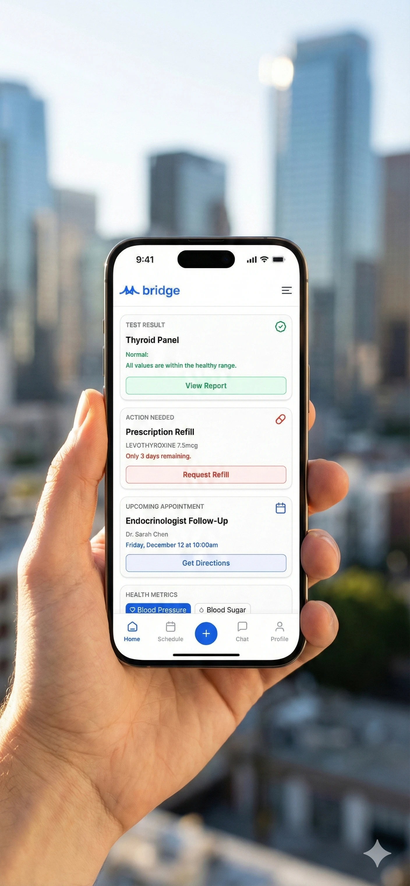
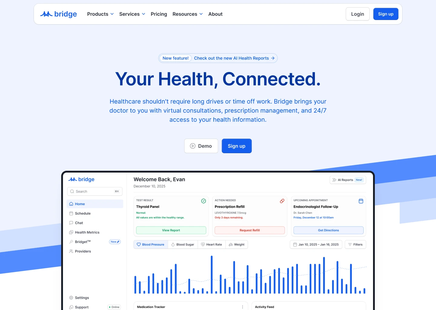
- View image 1: Bridge, a patient health app concept where each card shows one status and one next step: results, refills, appointments.
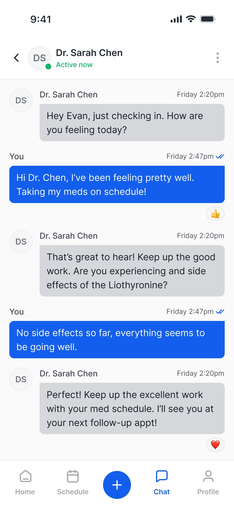
- View image 2: A mobile chat screen where a patient messages their doctor, with clear sender labels, read receipts and reactions.
- View image 3: Book cover for The Architecture of Intelligence, with a line diagram of logic-gate shapes in four colors on black.
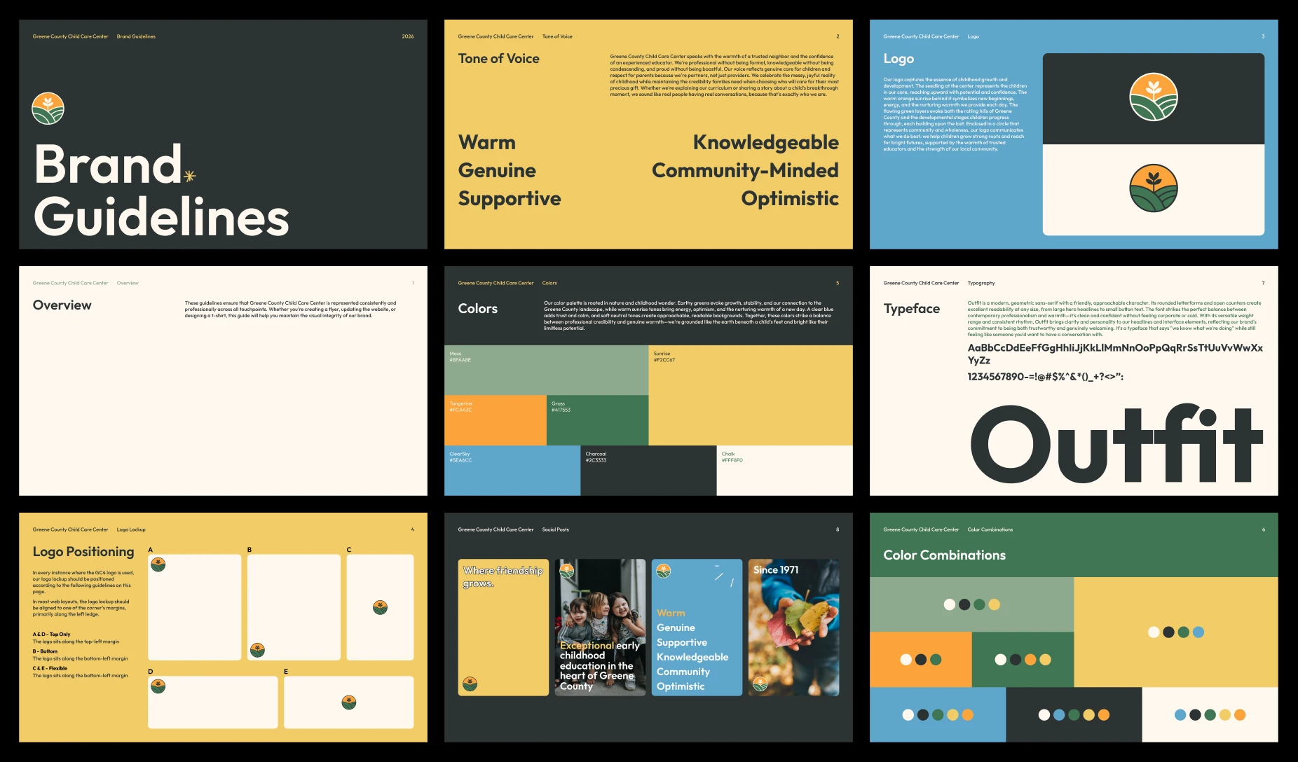
- View image 4: Brand guidelines for Greene County Child Care Center: logo, tone of voice, colors, Outfit typeface and social posts.
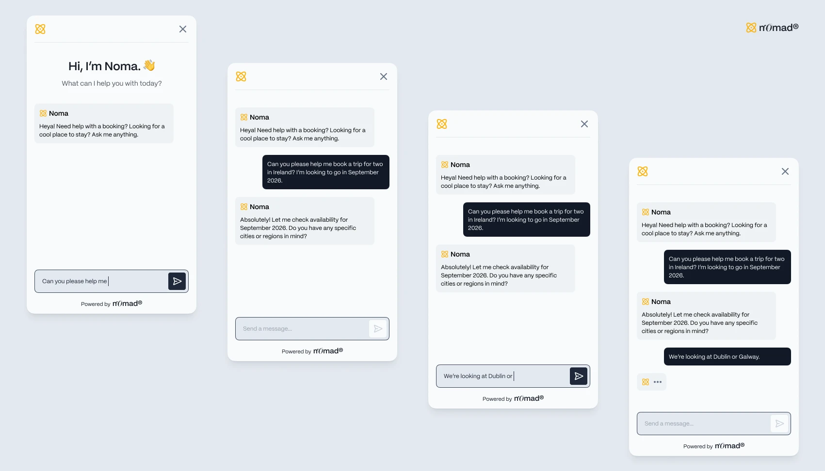
- View image 5: Four states of Noma, a chat assistant for a travel booking product, from greeting to typing indicator.
- View image 6: Bridge telehealth landing page where the hero leads straight into a patient dashboard with health metrics and alerts.
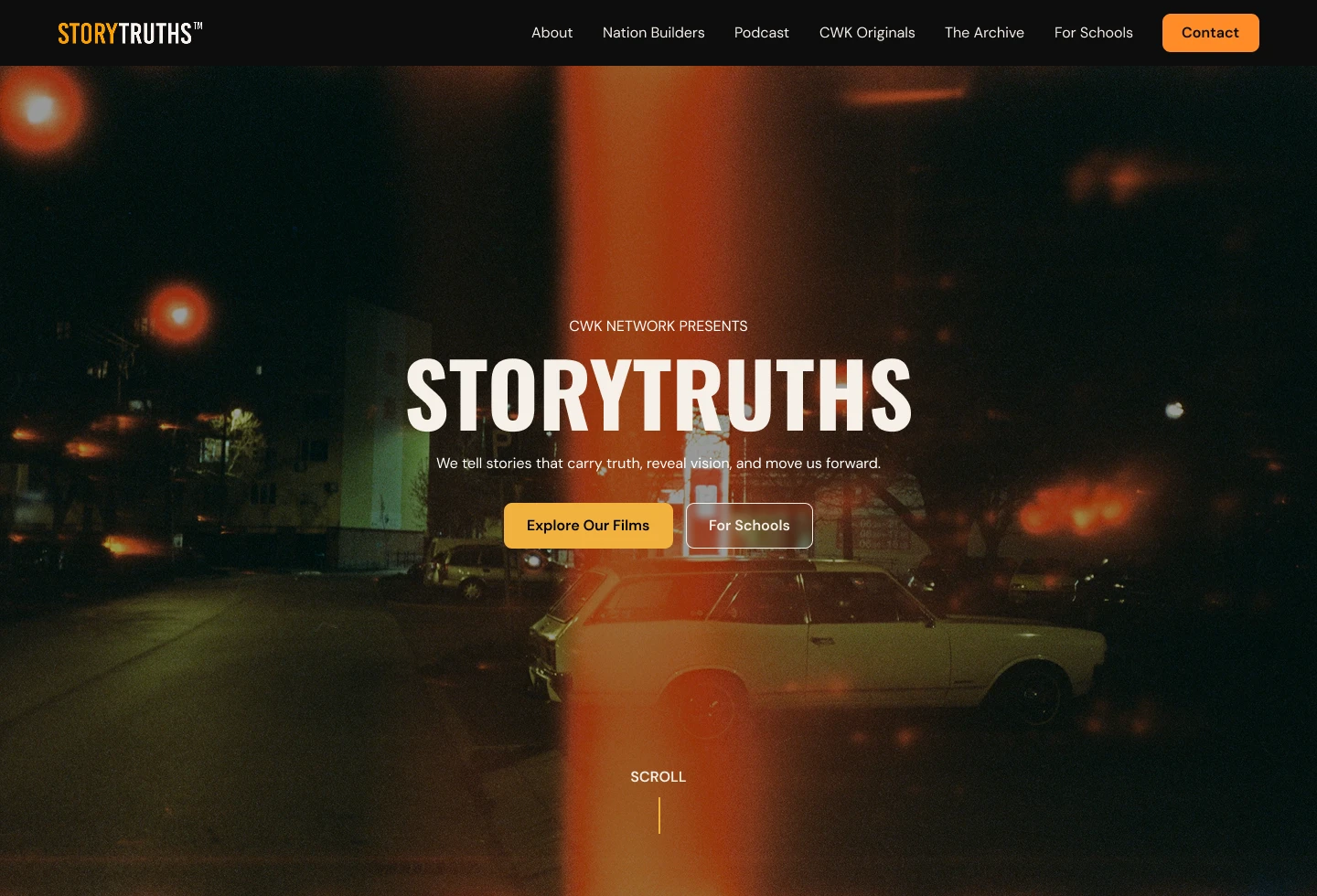
- View image 7: Homepage hero for StoryTruths by CWK Network, with condensed type set over a grainy night street photo.
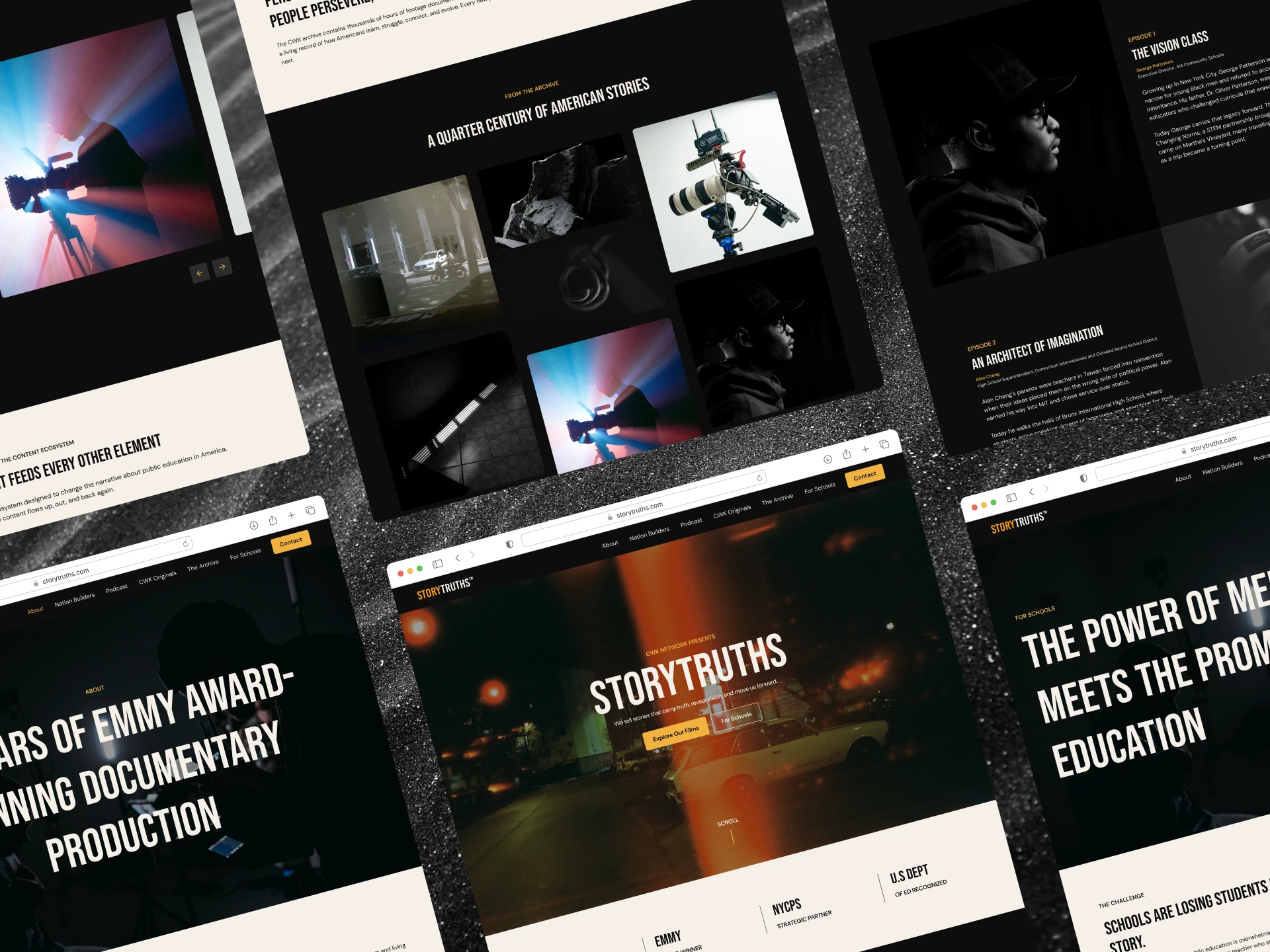
- View image 8: Website design for StoryTruths, a documentary brand, with condensed headlines over dark, cinematic film stills.
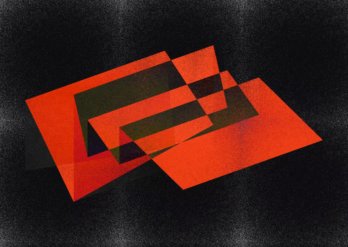
- View image 9: Overlapping red-orange planes on a grainy black field, where each overlap opens a darker window into the layer below.
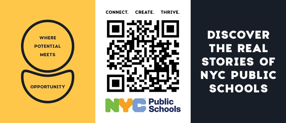
- View image 10: A tri-panel NYC Public Schools banner: yellow mark, central QR code and a heavy type line on navy, read left to right.
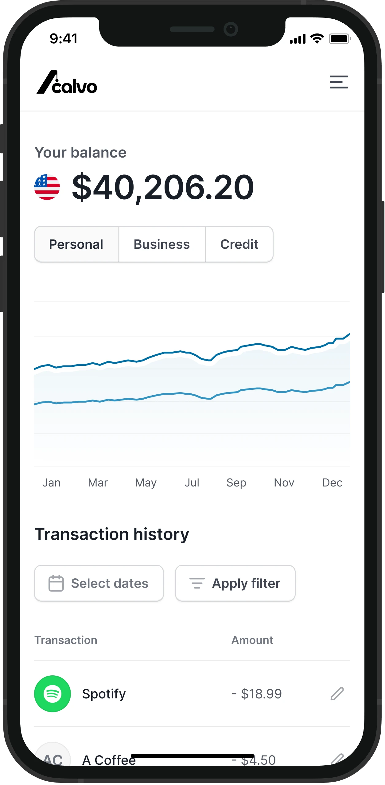
- View image 11: Mobile banking screen for Acalvo with a balance, account tabs, a yearly trend chart and a filterable transaction list.
- View image 12: Promo graphic for Farmhand: a worker carries berries through a foggy field, with a short headline set low and quiet.
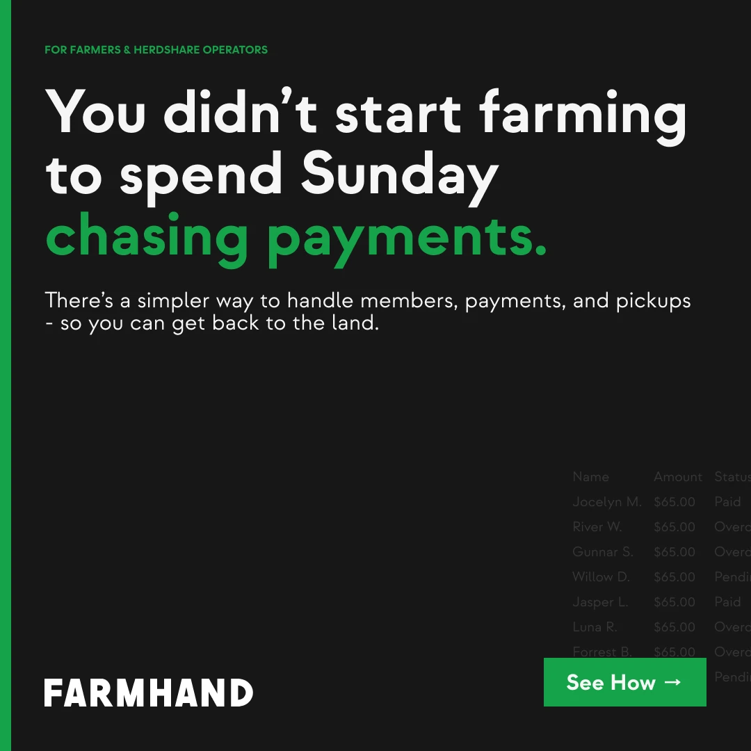
- View image 13: Ad concept for Farmhand, a tool for herdshare farmers, with a faded payments table behind the headline.
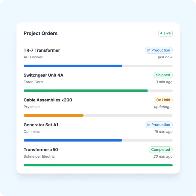
- View image 14: A live order tracker where each row pairs a status tag, a timestamp and a color-matched progress bar.
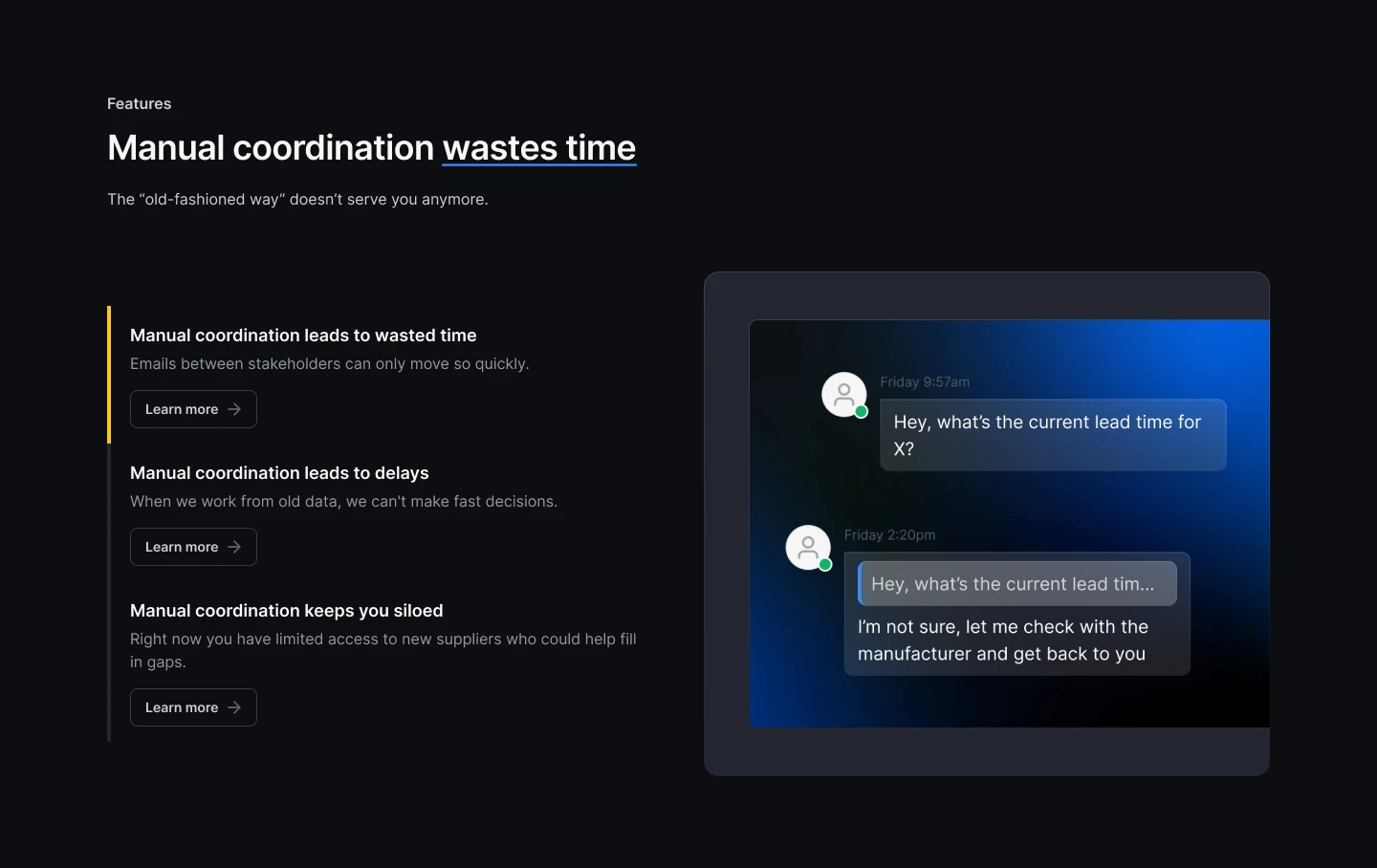
- View image 15: A dark features section that pairs three problems of manual coordination with a chat showing a slow supplier reply.
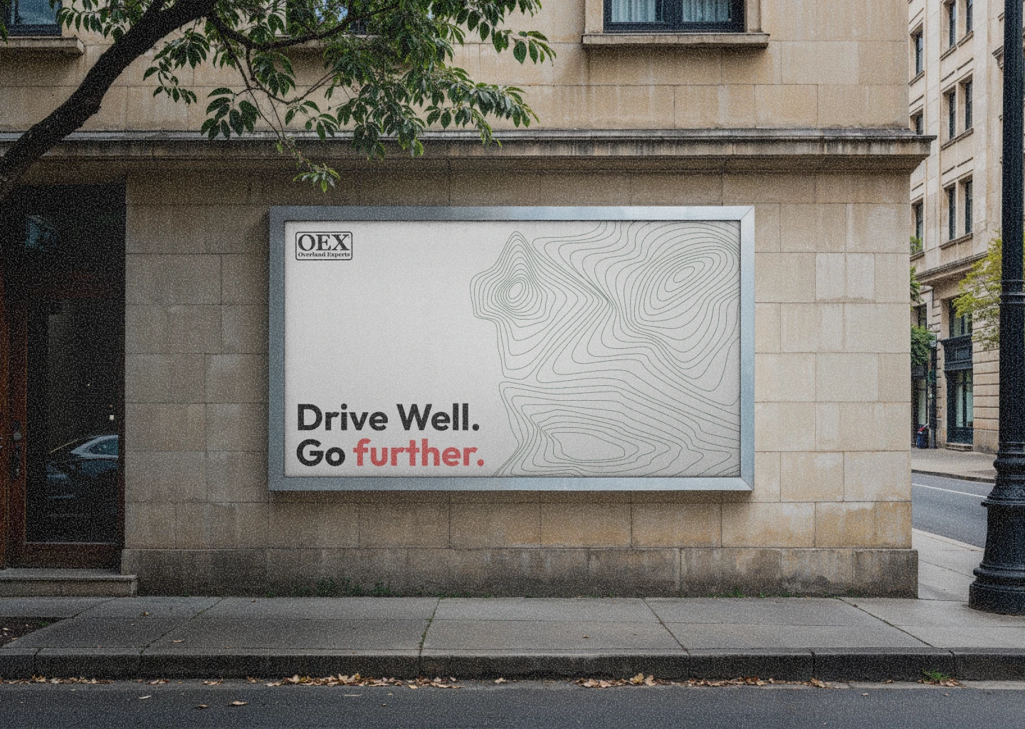
- View image 16: Street billboard concept for OEX where quiet contour lines and one red word carry the message.
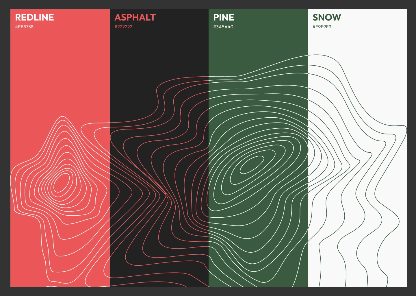
- View image 17: A four-color palette of Redline, Asphalt, Pine and Snow, tied together by contour lines that cross every swatch.
- View image 18: Square graphic for Adfin: "Automate finance" in a green bar over contour lines, with a hand-drawn circle around "Automate."
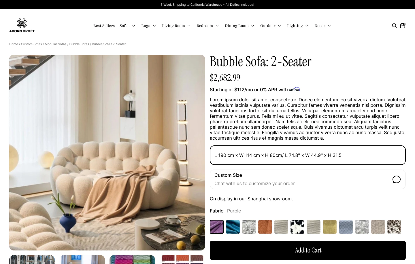
- View image 19: Product page for Adorn Croft's Bubble Sofa, with size, financing, custom sizing and fabric swatches stacked beside the photo.
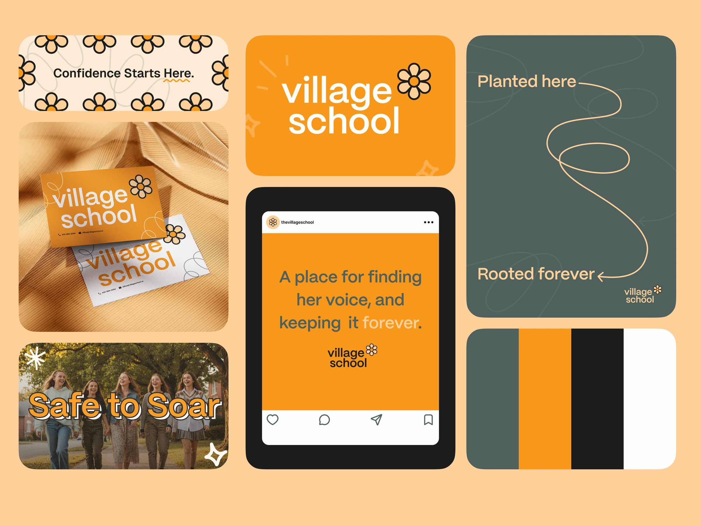
- View image 20: Brand identity for Village School: a daisy mark, warm orange and slate palette, and lines like "Planted here, rooted forever."
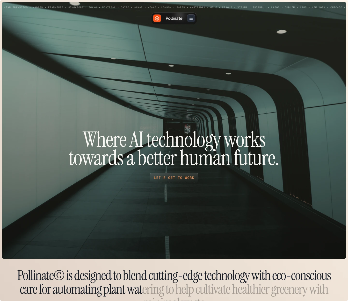
- View image 21: Landing page for Pollinate, an AI plant-watering concept, with a serif headline over a dark tunnel photo.
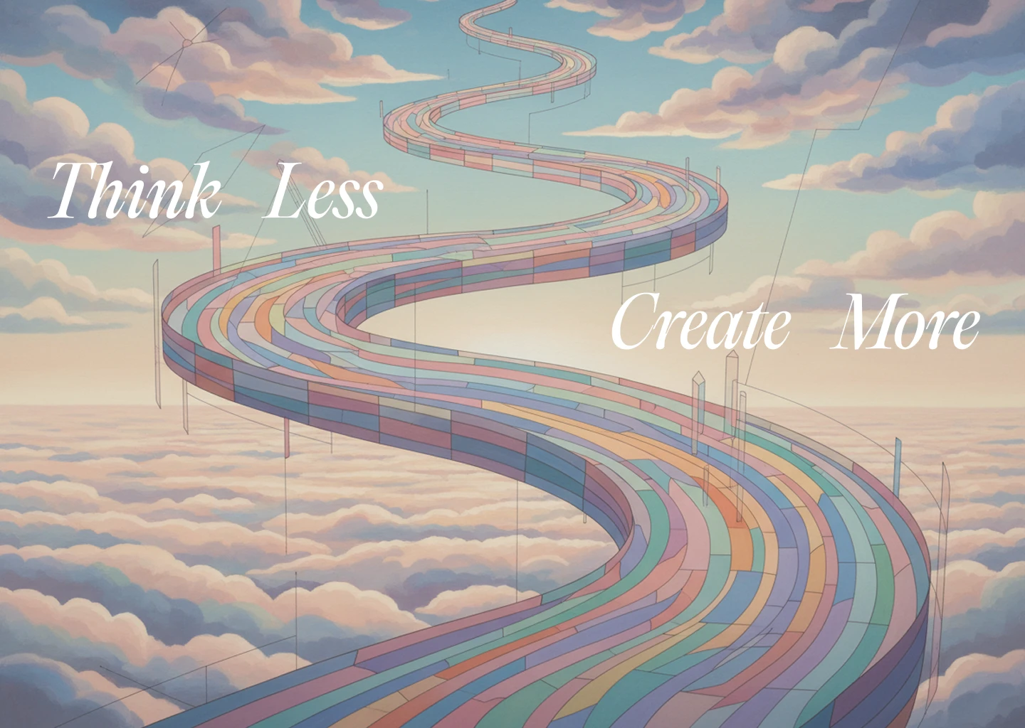
- View image 22: A pastel tiled road winds through the clouds toward the horizon, framed by the words Think Less and Create More.
- View image 23: A sunset over a field, sliced into horizontal bands so the sky, two small figures and points of light blur into stripes.
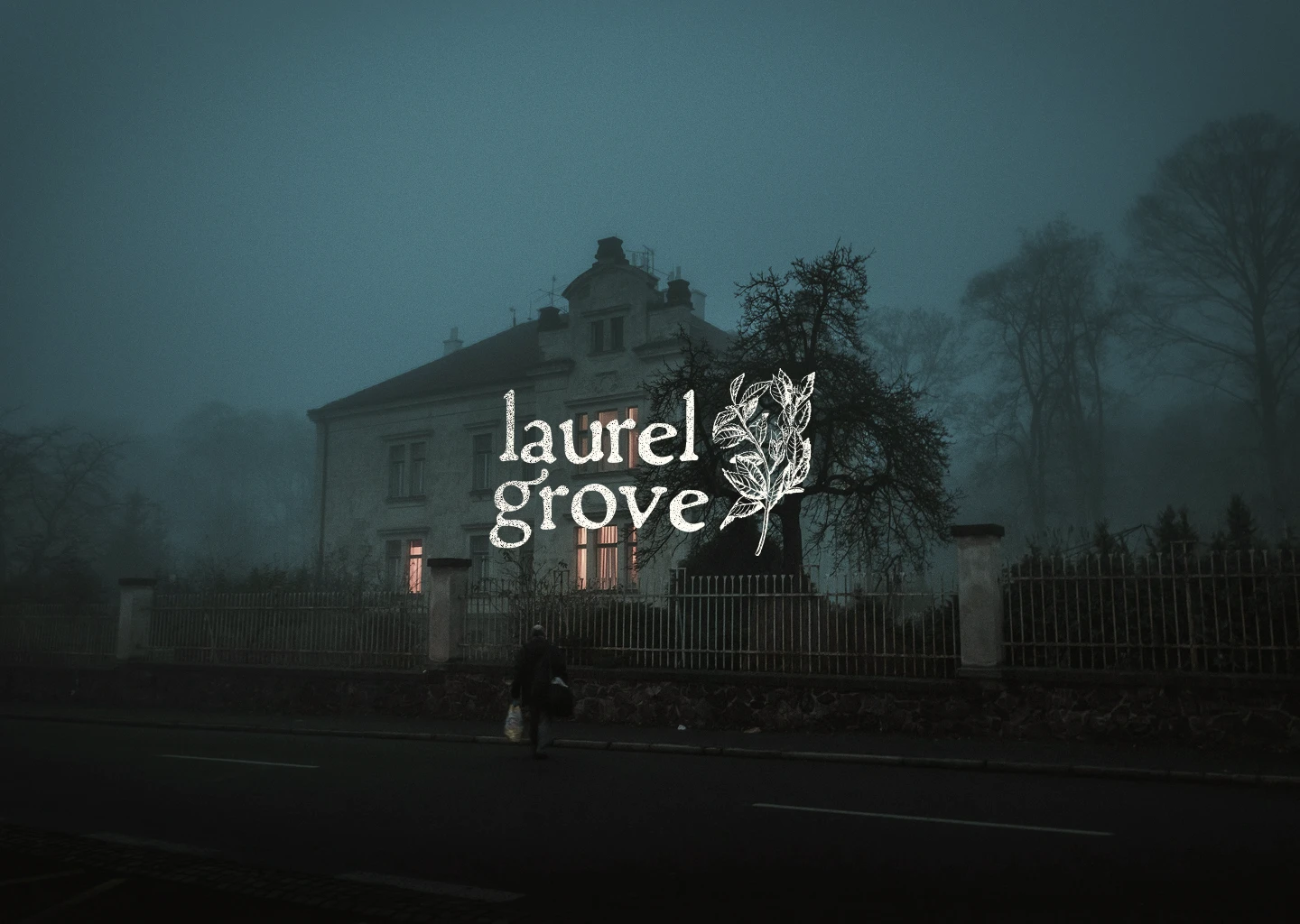
- View image 24: A Laurel Grove logo with a hand-drawn laurel sprig and textured serif type, set over a foggy house at dusk.
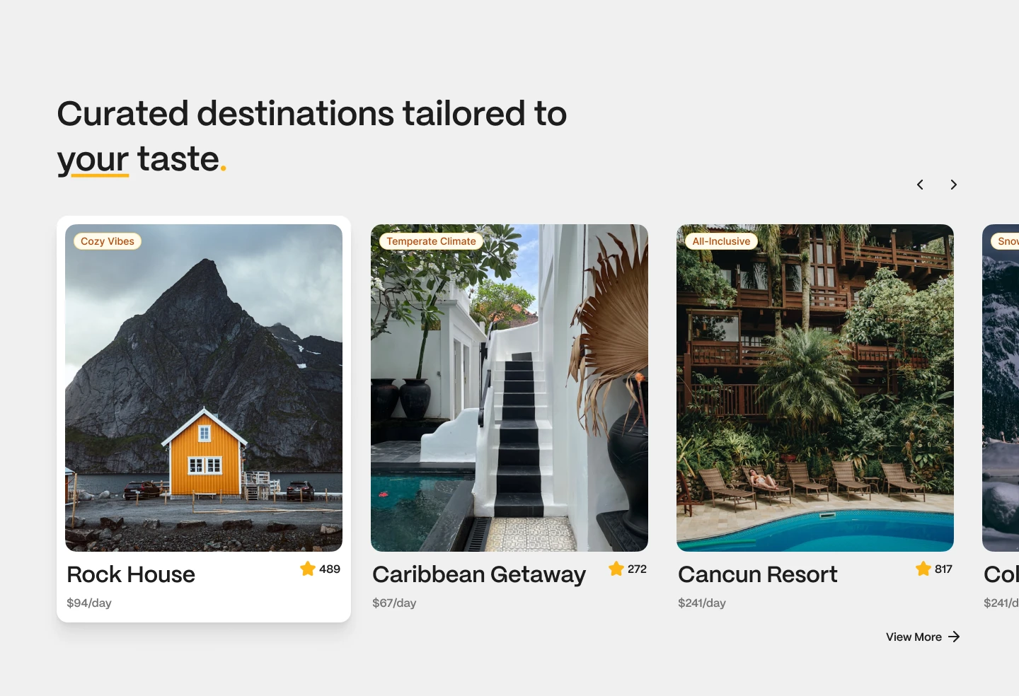
- View image 25: A travel carousel of destination cards, each pairing a large photo with a mood tag, star rating and daily price.
- View image 26: Brand concept for Rabbit.ai: a pixel-built mark and clean wordmark placed over soft forest light.
- View image 27: The Casa logo in white serif type, placed at the center of a photo of wooden doors, terracotta wall and palm.
- View image 28: Brand mark for Homelify, a simple house-shaped icon set beside a lowercase wordmark over a warm living room photo.
- View image 29: Lonestock Farms wordmark with a cactus mark, set in white over a grassy hill path under a wide blue sky.
- View image 30: Flag & Banner wordmark over a grayscale city skyline that dissolves upward into fog in vertical streaks.
- View image 31: Brand mockup for Farrow: a pixel-built mark and squared wordmark placed over a shadowed greenhouse scene.
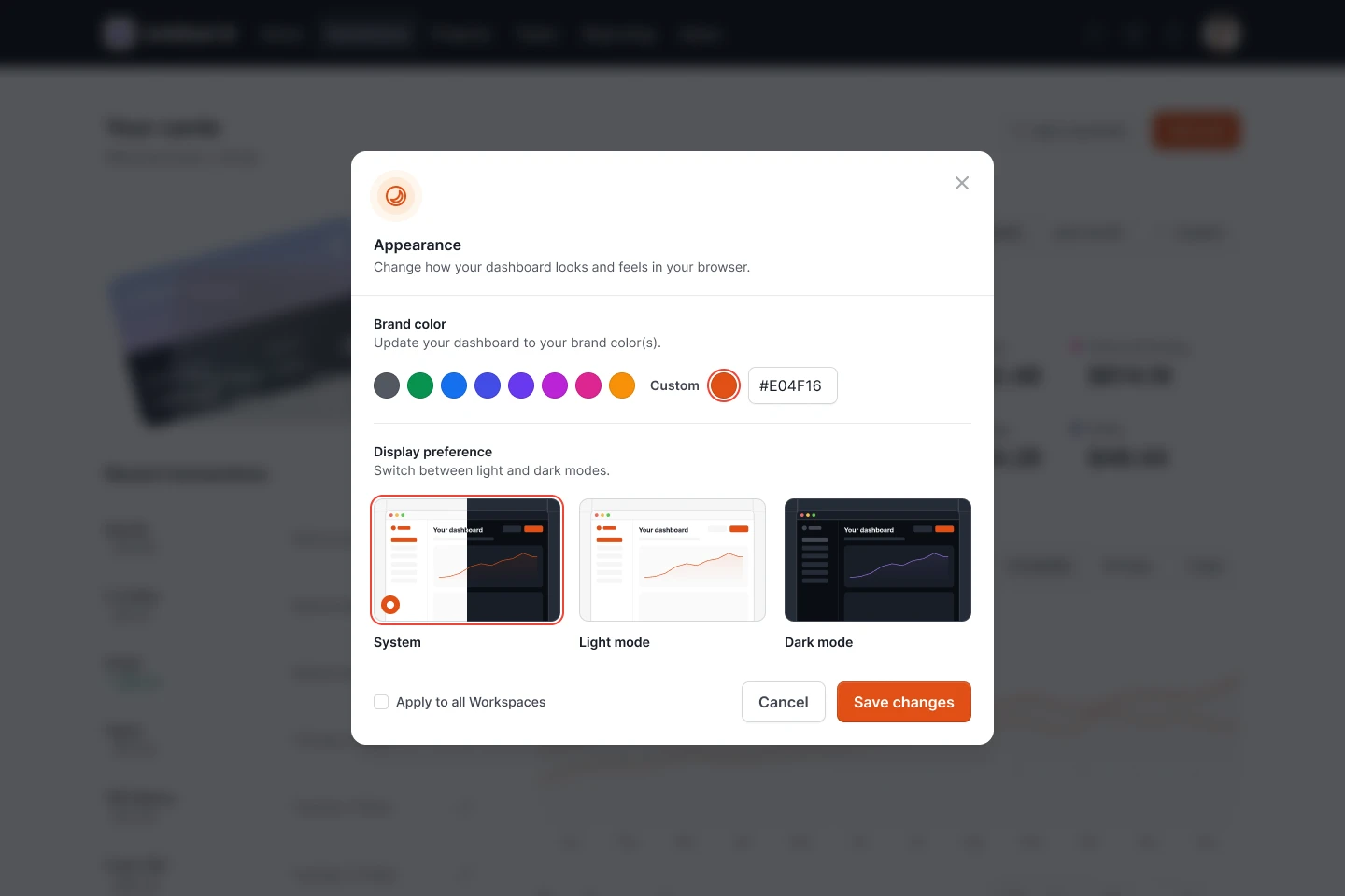
- View image 32: An appearance settings modal with brand color swatches, a custom hex input and previews for system, light and dark modes.
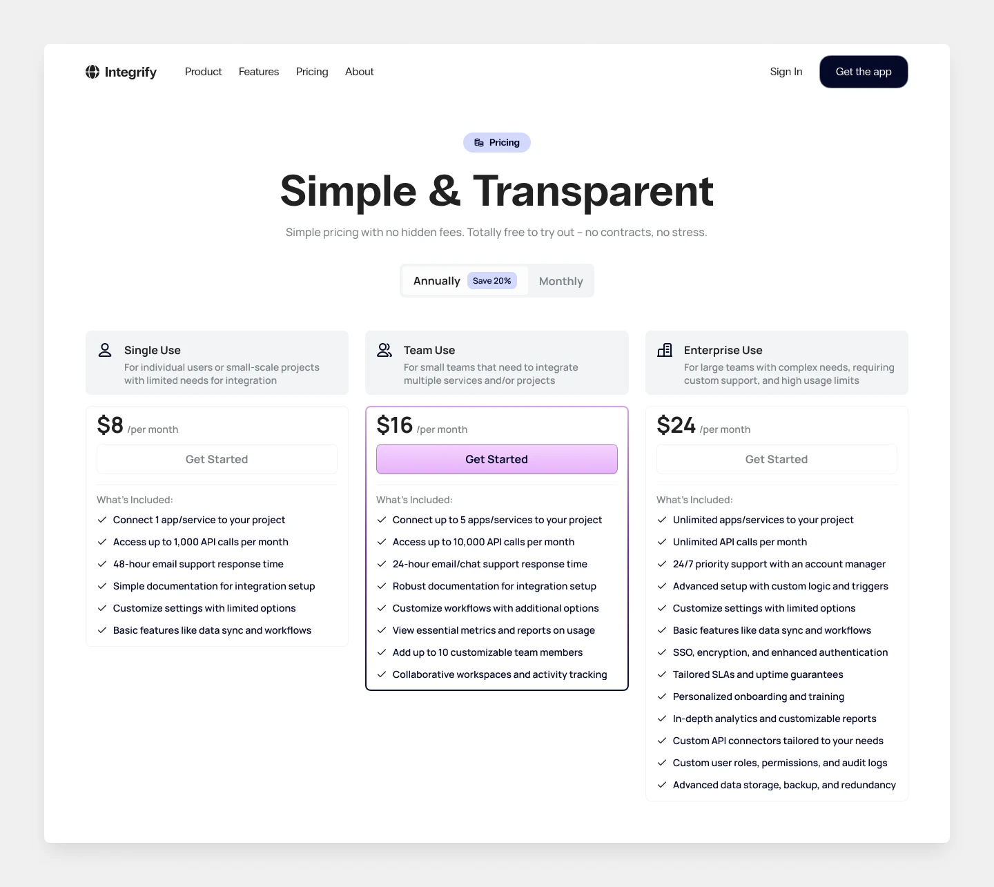
- View image 33: Pricing page for Integrify with three plan tiers, an annual toggle and a highlighted Team plan in the center.
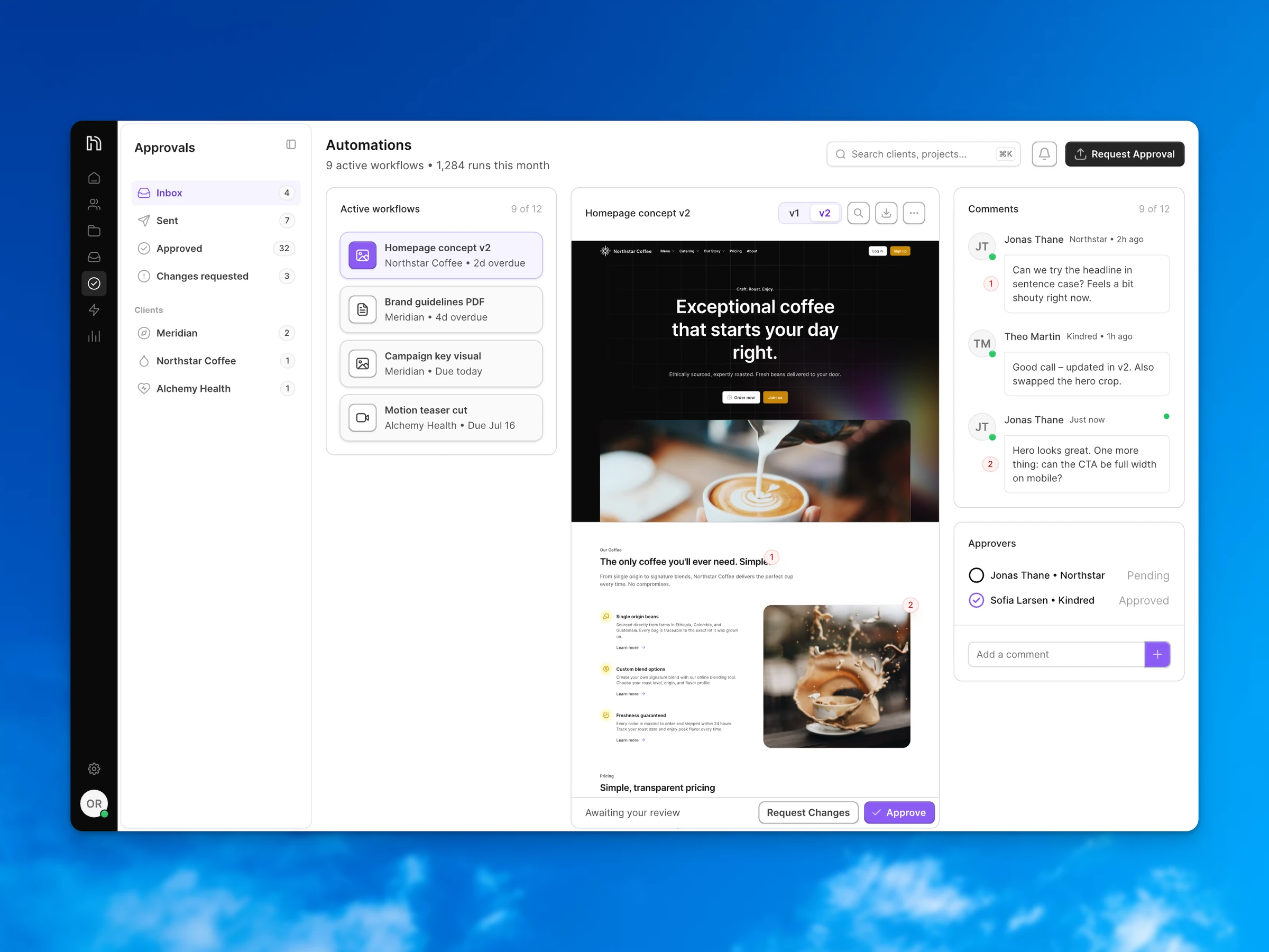
- View image 34: An approval workflow where numbered comments pin to the design and v1 and v2 sit one click apart.
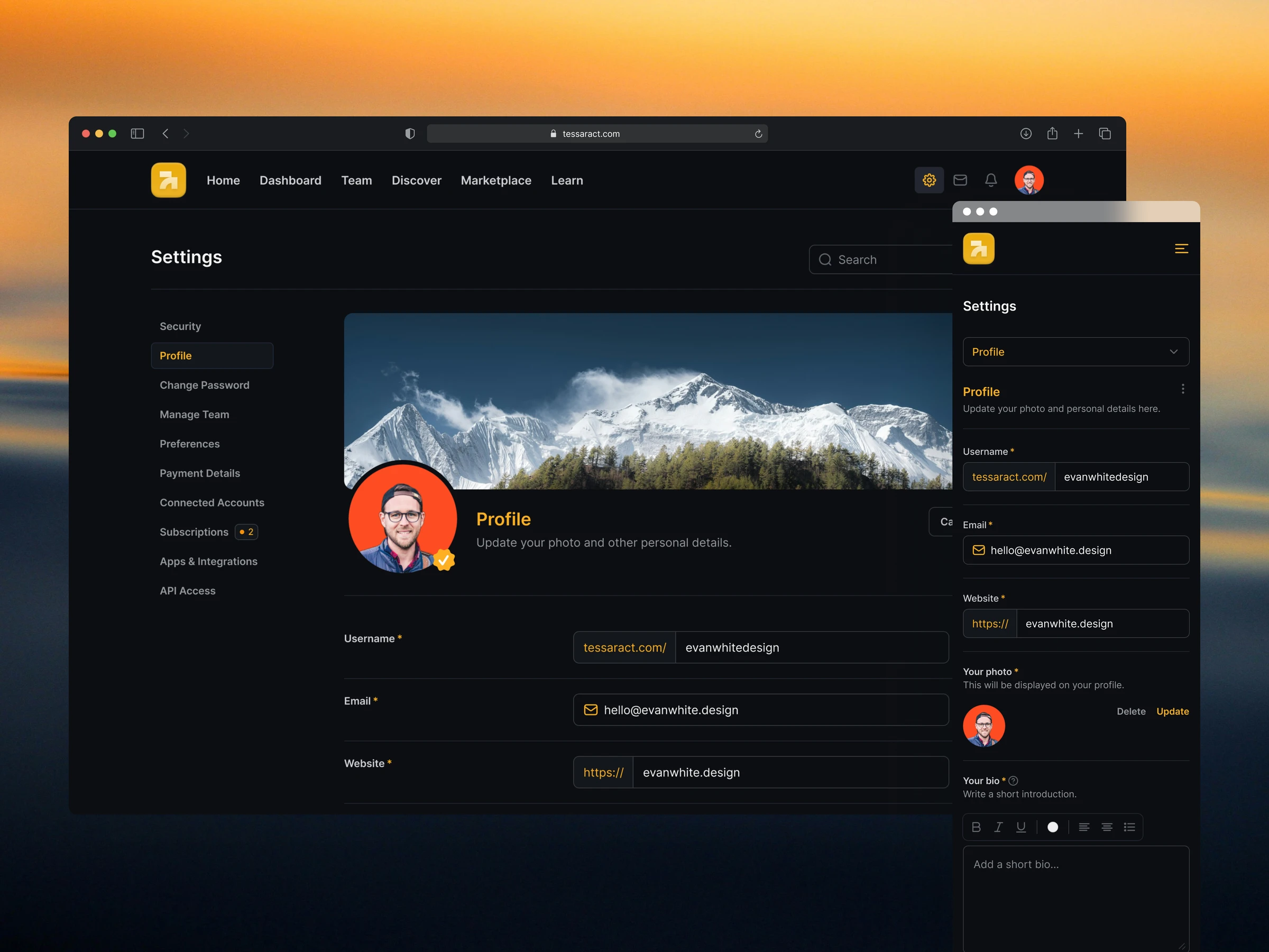
- View image 35: A dark-mode profile settings page for Tessaract, shown on desktop and mobile with the same fields adapted to each width.
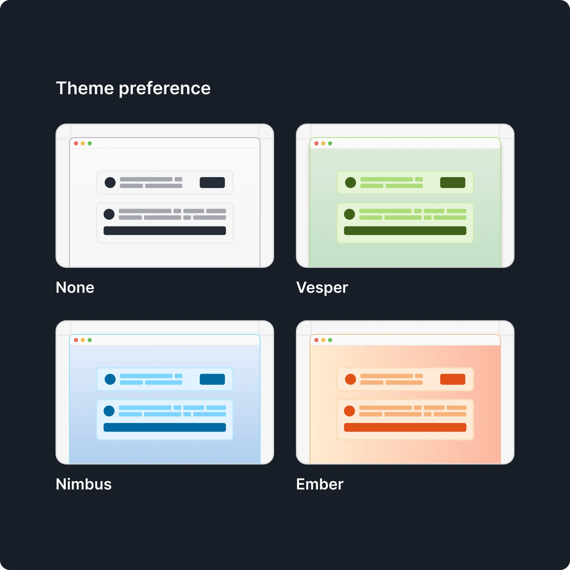
- View image 36: A theme picker with four options, None, Vesper, Nimbus and Ember, each previewed as a small browser window.
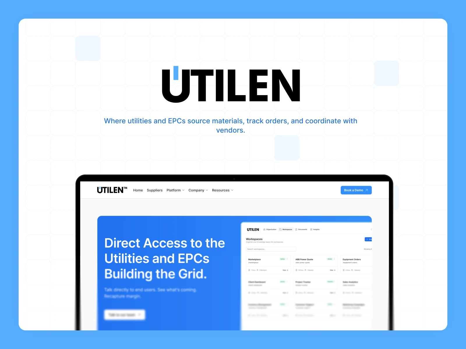
- View image 37: Website concept for Utilen, a platform where utilities and EPCs source materials, track orders and work with vendors.




Gallery
Work I’m proud of that doesn’t fit in a case study.
Drag to look around. Click any image to see it larger. Drag to look around. Tap an image to see it larger.