
Record details
Every version of a document in one place.
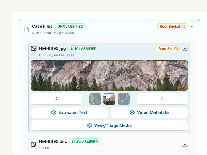
I designed the record details panel, where analysts preview the original file in the app, reach everything derived from it in one click, and share records only with people cleared to see them.
At a glance
- Problem
- Analysts had to download each original file just to look at it, and its extracted text and translations were just as hard to reach.
- What I did
- Designed one panel that previews the original file first, with every derivative one click away and secure sharing built in.
- Result
- Files preview in the app with no download, and a shared link never widens who can see a record.
01 / The problem
The real file was one download away.
Analysts work with foreign documents taken directly from devices during collection. What they care about most is the original file, exactly as it was collected.
The legacy system only listed links to each file, so looking at one meant downloading it first. Everything the system derived from those files was just as hard to reach.
02 / Research
Users wanted the real file.
User feedback set a clear order. Access to the original file came first. Derivatives like extracted text, machine translation and entity extraction came second, but analysts still needed them on hand to use however they wanted.
Two other gaps stood out. Each record's place in its project and batch took a lot of scrolling to piece together, and there was no way to leave comments.
03 / Approach
One panel, ordered by what matters most.
- 01
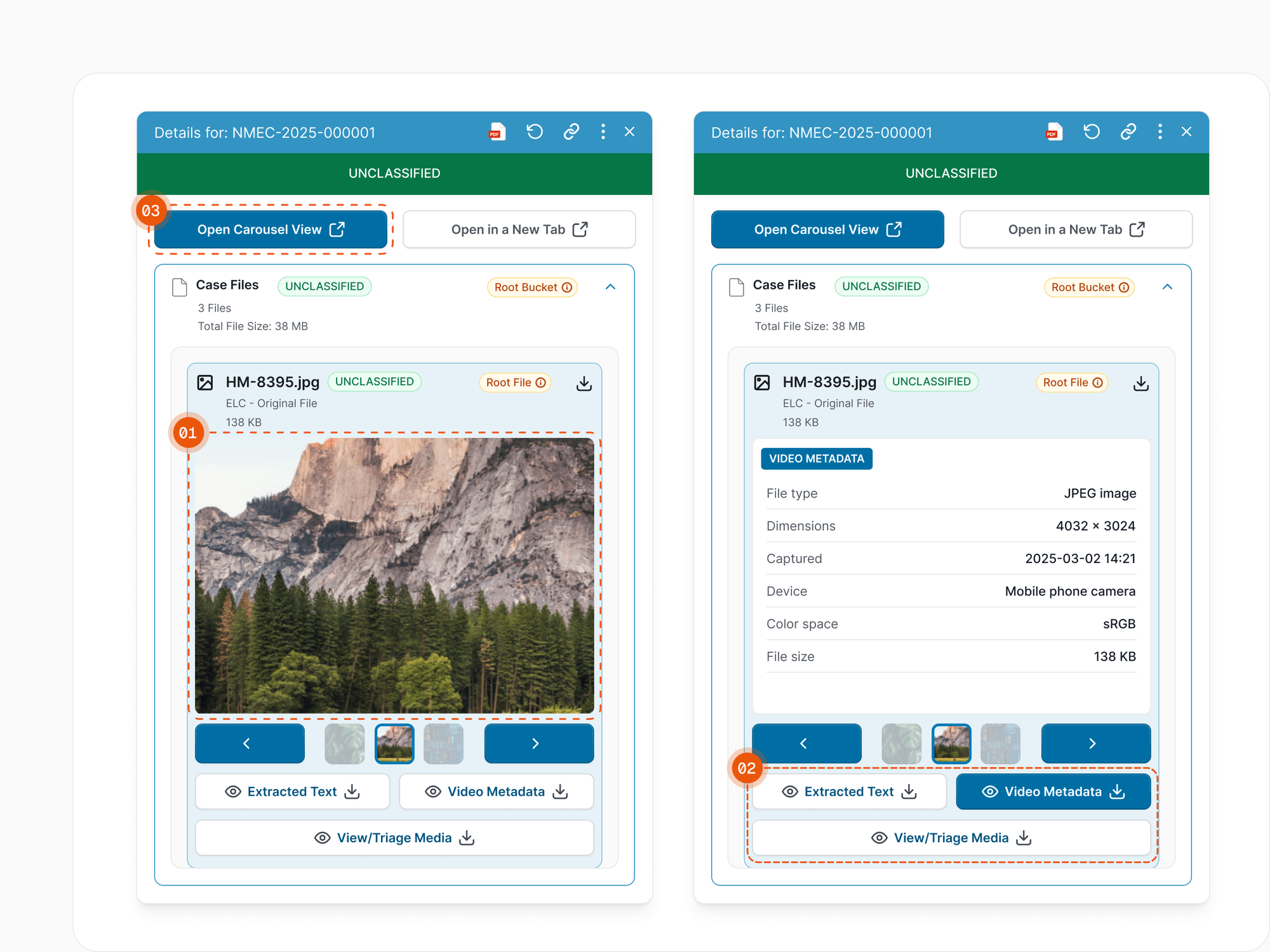
The original file leads
The main viewer previews the real file in the app, with download one click away for anyone who needs the file itself.
- 02
Every derivative one click away
Buttons for extracted text, machine translation, entities and other derivatives swap what the main viewer shows. A carousel view opens every file in a larger modal.
- 03
Context in tabs, not one long scroll
Project, batch and record associations each get their own tab, and comments are built in, so the panel never has to show everything at once.
04 / Key decision
Lead with the file, not the derivatives.
The biggest call was the order of things. The original file leads the panel because it's what analysts trust and act on. Its derivatives sit one click behind it.
Those derivatives also do important work users never see. Everything extracted from a file goes into the search index, which makes every search more robust. They didn't need top billing in the panel to do that job, but users still needed a way in, so each one is a single click away.
05 / Sharing
Share the record, not the access.
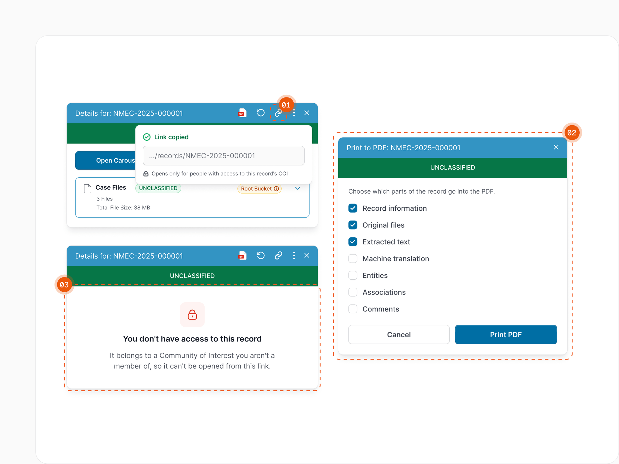
Sharing creates a static URL that points straight to one record. For a flat copy, a pretty-print option lets users choose which parts of the record go into a PDF.
Security shaped the rest. Many records belong to a Community of Interest (COI), a tightly controlled set of data whose owner decides who can see it, and the platform holds many of them. A shared link never widens access: someone outside a record's COI who opens it sees a clear message that they don't have access, not the record.
06 / Outcome
Preview, don't download.
The viewer's layout came straight from user feedback, and its biggest win is the simplest one: analysts preview files in the app instead of downloading each one just to look at it.
Downloads needed to preview a file
Link per record, gated by COI access
07 / What's next
Put the original beside its translation.
Today each derivative swaps into the main viewer one at a time. Comparing an original with its translation or extracted text is core to the work, so next I'd test showing them side by side.
I'd also measure how often analysts open each derivative, to see which ones have earned more room in the panel.