
Unified search
One search across many sources.
I designed a search experience that presents records from very different data sources in one results view, so analysts get everything relevant in one place, in seconds instead of minutes.
At a glance
- Problem
- Records from many differently structured sources, and a legacy tool where complex searches could take minutes.
- What I did
- Researched on site with analysts, then designed one dense results view with filters in view, visible matches, and simple and advanced modes.
- Result
- Complex searches went from minutes to seconds. Internal usage rose 65% and engagement 25% in the first quarter after launch.
01 / The problem
Many sources, each shaped differently.
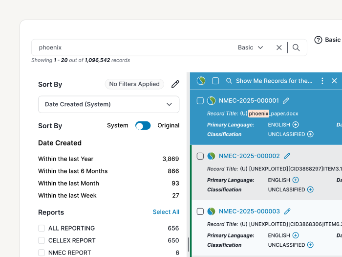
The platform manages a large repository of foreign-source documents for teams across the defense and international intelligence community. Its records come from many data sources, and each one is structured differently.
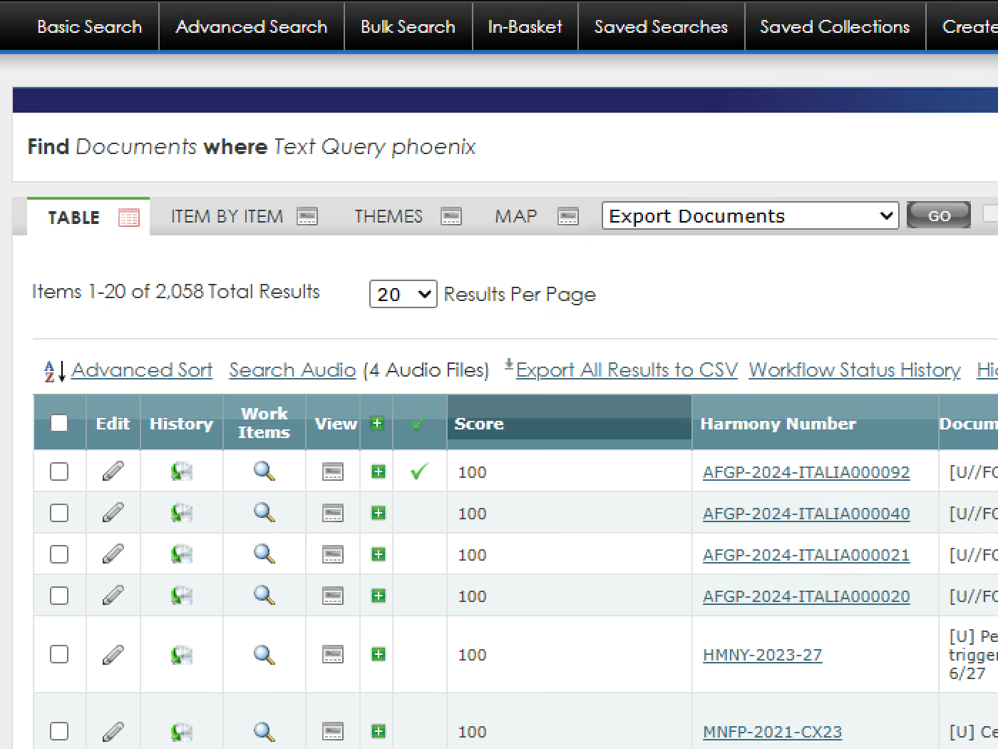
The legacy tool made analysts work around those differences, and complex searches could take minutes. Every slow or missed search risked paying to collect or translate something the organization already had.
02 / The users
Two very different types of users.
Intelligence analysts search constantly and need precision. Policymakers search occasionally and need a fast, trustworthy answer. The design had to serve both without slowing either one down. That split is why search has two modes.
03 / Research
Research meant going on site.
The platform runs on air-gapped networks, reachable only from specific secure locations. To learn how people actually search, I interviewed users where they work.
Two needs came up in every conversation: speed and accuracy. The legacy tool fell short on both. Refining a search took many clicks to find each additional filter, and its matched-term highlighting was so inconsistent that users couldn't rely on it.
I also studied established patterns for search, filtering and dense results before designing each flow, so every screen started from what users already know.
04 / Approach
Designed for the hardest searches. Simple for everyone else.
- 01
Start from power users
Their edge cases define what the system must handle, so I designed from their requirements first.
- 02
Separate simple and advanced search
Occasional users never face the advanced query tools unless they choose to.
- 03
Keep filters in view
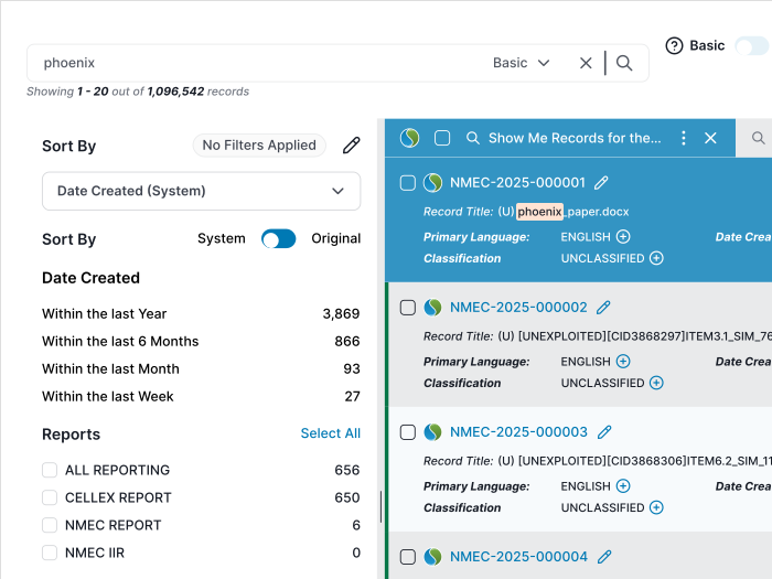
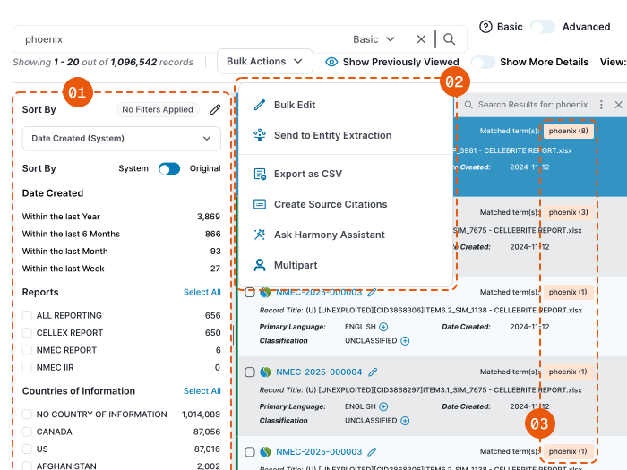
A single-view layout keeps filters persistent and dynamic beside the results, so users tailor a query without hunting for options.
- 04
Make every match visible
Each result shows where the search terms matched and how many times they appear in the record, so users can judge relevance at a glance.
- 05
One results view for every source
Records from every source share one consistent layout of key metadata, so users read every result the same way.
- 06
Go deeper without losing your place
Results connect to a record details panel, so analysts can inspect a record and keep their position in the list.
05 / Key decision
Dense on purpose.
The biggest decision was how to structure the results so that everything stayed within a few clicks. I chose density: filters, results and record details share one view, with almost no empty space.
That choice has a cost. Some users find the layout overwhelming and complex, because there is almost no white space. So the real design work became adding new buttons and features without adding mental load, for power users who want everything and occasional users who just want a quick answer.
Two techniques do most of that work. Related actions live inside nested button groups and menus, so one button can hold several actions instead of crowding the toolbar. And modals are used sparingly, saved for content that needs room of its own, like the image carousel or viewing an original file inside the app.
06 / Outcome
From minutes to seconds.
The new platform runs on Elasticsearch instead of an outdated SQL architecture. The design's job was to make the experience match that speed: clear, consistent and pleasant to use, where the old tool was neither.
Complex searches that took minutes in the legacy system
Internal usage in the first quarter after launch
User engagement in the first quarter
User retention after research-backed iterations
07 / What's next
Lighter for the occasional user.
Density serves analysts well, but some occasional users still find the view overwhelming. Next, I'd test a lighter default for them: advanced filters and secondary metadata stay out of the way until they ask for them, measured by how quickly they reach an answer.
I'd also tie each release to usage data, so decisions like what earns a spot in the toolbar follow what people actually use.